espace epilation
Sector: Beauty
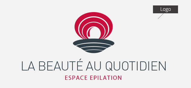
logo
claim
brand identity
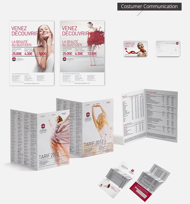
stationery
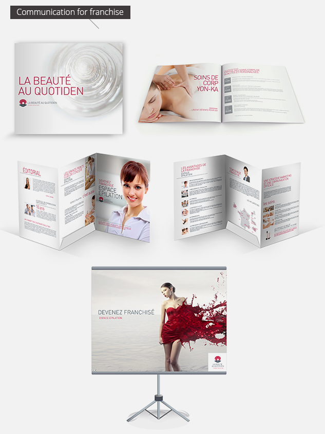
brochure
promo cards
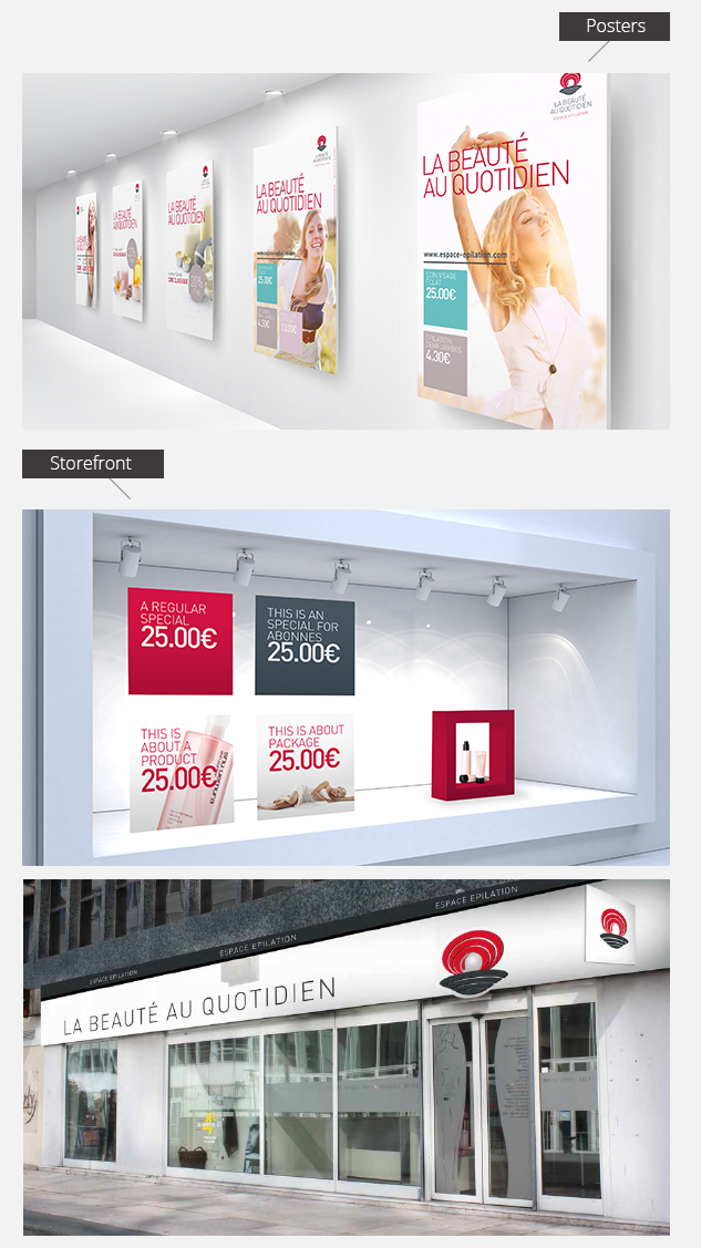
in store panels
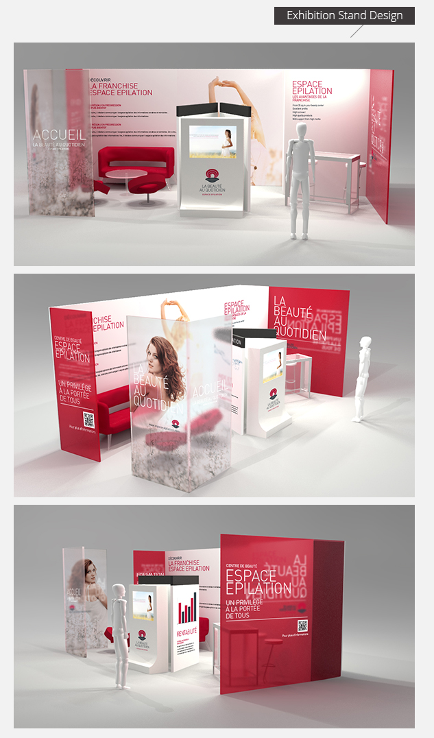
exhibition stand design
products packaging
corporate video
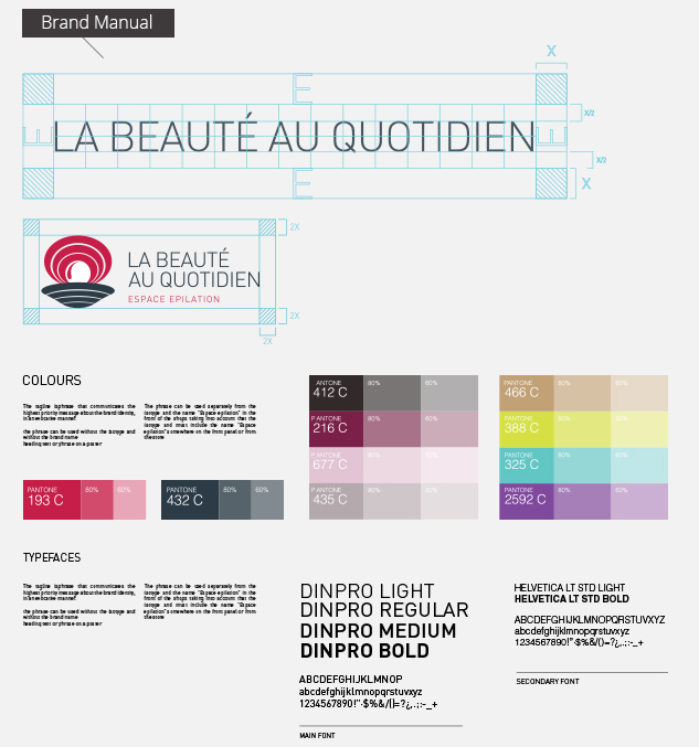
brand manual
CLIENTE
Created in 1995 as first franchise in France in beauty industry and been market leader for a couple of years. Today the network represent 65 institutes, with around 40/45 beauty centers in Paris.
Espace Epilation does all the services offered in a classic spa or institute, a bit more focused on hair removal (considering hair removal being 80% of the business for any beauty institute).They also offer body treatment, facial and skin care, manicure and pedicure, massages for cellulite. 10% of the customers are men (growing trend).
NEEDS
With new identity the company is expecting to show customers at a first sight that Espace Epilation does much more than hair removal (as it's been known until now by the market). Desire is to quit this image of hair removal specialist and wants to show they are a full services beauty institute, but democratic and affordable.
The long term strategic goal is to federate more the current network of franchised shops, and drive a more corporate communication, since today each shop is free to do things by itself, due to a lack of strong brand identity and guidelines.
At the same time there's the goal to increase the number of institutes, strengthen the brand awareness in the all country.
At the moment Espace Epilation is the main and only brand, there is no other sub-brand, as they don't have products with their own brand, always third party companies. The new identity will be applied in store (inside and outside), all merchandising and communication materials, stationery, website and social networks.
The change of the logo needs to be done smoothly: at first on the web, then on paper communication material, then merchandising, and finally stores. This decision is due mainly to structural reasons. Today the stores need to feel a new positive dynamics before agreeing to afford radical changes in their stores at their own expenses.
So that re-designing the logo is a necessity for the marketing, but also a psychological strategy to push a new positive attitude in the company.
DELIVERY
• The idea is that the logo has to be strong enough to work by itself, without even mentioning the name if possible: something easy to recognize at a first glance, especially in the streets (thinking to stores signs, billboards, adv), that is the reason for the use of an icon.
• Together with the new logo, which distinguish itself among other competitors logo by colors choice, also to feel closer to male customers, we have determined a new tagline (claim): "la beautè au quotidien", in order to widen the borders of the brand perception in customers minds (not only "hair removal").
• In order to help franchisees to better understand the brand change they are undergoing, we delivered some specific communication tools to introduce them to the change: two corporate video and a complete brand manual, with practical applications of the new logo and brand.
• To strengthen the brand awareness (in customers and franchisees as well) we also suggested the realization of branded products (visage cream, massage oil, etc.).
www.espace-epilation.com